This web page is intentionally created with accessibility errors to demonstrate the functionality of automatic accessibility checkers for web pages. View this webpage in an accessibility checker (WAVE) to help identify accessibility issues in other forms of digital content.
Error Types: Errors must be fixed. Alerts should be fixed. These fixes, both errors and alerts, improve the accessibility and usability of the content.
Best Practice: Pair color with another visual cue. Use color contrast checkers to ensure colors have the appropriate contrast ratio.
Color as Meaning
Color is not used alone to convey information.
Example: See the gray link for more information.
Error Type: Error
Best Practice: Do not use color as an indication. Use text and other visuals.
Color as Emphasis
Color used to convey meaning, alert a user, or show emphasis is paired with another visual cue (e.g., text, symbol, bold, etc.).
Example: See the red text for the important announcement.
Don’t use color alone as an indication.
Error Type: Error
Best Practice: Do not use color alone as emphasis. Use text and other visuals.
Color Contrast
There is sufficient color contrast between the foreground text, the linked text, and the background colors.
Color Contrast: Text has appropriate color contrast with the background and meets contrast ratio requirements (WCAG 2, AA).
- For normal-sized text (e.g., 12pt or 16px) and text-based images, the ratio is 4.5:1.
- For large text (over 18pt/24px or bold and 14pt/19px), the ratio is at least 3:1.
Example: See color contrast examples with the full text without color adjustments afterwards.
Normal-sized Text
The light gray color lacks sufficient contrast against a white background for the font size (18px). It has a color contrast ratio of 1.6:1.
The light gray color lacks sufficient contrast against a white background for the font size (18px). It has a color contrast ratio of 1.6:1.
Larger Text
This bright crimson color lacks sufficient contrast against a white background for the font size (18px). It has a color contrast ratio of 3.9:1.
However, at a larger font (18pt or 24px), the color contrast is sufficient.
Bold text can be 14pt or 19px and meet the color contrast ratio.
This bright crimson color lacks sufficient contrast against a white background for the font size (18px). It has a color contrast ratio of 3.9:1.
However, at a larger font (18pt or 24px), the color contrast is sufficient.
Bold text can be 14pt or 19px and meet the color contrast ratio.
Error Type: Error
Best Practice: Ensure everyone can read the message by using appropriate color contrast.
Text Color on Images
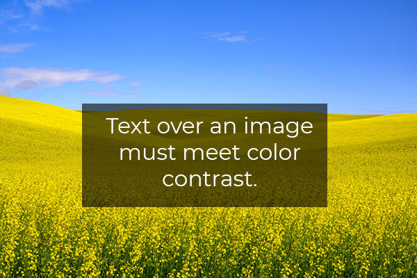
Text placed on images is easily distinguishable and readable visually and by assistive technology.
Example:


Error Type: Error
Best Practice: Because of the varying colors in an image, it is best to include a background color between the text and image. However, the text embedded in an image presents other accessibility issues, including the need to include it in the alt text.
Accessibility Checks
Use this checklist as a guide to ensure your colors and color contrast are in an accessible format.
- Color is not used alone to convey information. [manual]
- Color used to convey meaning, alert a user, or show emphasis is paired with another visual cue (e.g., text, symbol, bold, etc.). [manual]
- There is sufficient color contrast between the foreground text, the linked text, and the background colors. [automatic and manual]
- Text placed on images is easily distinguishable and readable visually and by assistive technology. [automatic (alt text) and manual (color contrast)]
Tools for Web Pages
- Browser add-ons and extensions simulate colorblindness in the browser.:
- Firefox: COLORVISION and Let’s get color blind
- Chrome: Let’s get color blind and Colorblindly
- WAVE (website) and browser extensions: This is a full-page accessibility automatic check. In the Contrast pane is a color contrast checker. It will indicate color contrast issues on the page. Selecting a color contrast icon identifies it on the page and updates the foreground and background fields with the colors. There is a Desaturation page link that converts the page to black-and-white.
- Web Developer (Browser Add-on): This browser extension features a Miscellaneous tab with a Display Color Picker option. The tool displays the hex code for the color at the mouse cursor. It is persistent on the page until it is checked off.
- Color Contrast Checkers: A list of color contrast checkers is listed on the Testing Tools page. These resources include tools for checking hex, RGB(A), and HSL color formats.
Want to check non-web page-based digital content? See the Digital Accessibility Testing/Scanning Tools web page for additional resources.
Additional Support
Analyze Color
- Is color needed to convey the message?
- What additional visual indicators must be included?
- Is there sufficient color contrast between the foreground and background color?
- Is text over the image appropriate for the purpose of the image?
Resources
-
Contrast Checker
Source: WebAIM
Check the foreground and background color using the hexadecimal format. Plus, use the Alpha value for transparency and the Luminance slider for perceived lightness.
Tags: Tool -
How your colorblind and colorweak readers see your colors
Source: Datawrapper
When visualizing data, you always use colors. But if you don’t know any colorblind people, it’s easy to forget that your charts have readers who can’t tell colors apart as well as you do.
Tags: Article, Sept-2025 -
Intro to colour contrast
Source: Design Good Practices
Colour contrast makes a big part of the user experience for all users. Accessibility guidelines however, are not always easy to follow. In this article we will see how to meet the requirements with practical examples.
Tags: Article -
The Impact of Color Contrast on Accessibility
Source: BarrierBreak
In this blog, we will explore the impact of color contrast on accessibility and why it is essential for creating an inclusive digital experiences. Before we delve in, let’s understand what color contrast is along with accessibility requirements.
Tags: Article -
Top 10 Common Accessibility Issues in Websites
Source: AFixt
But despite good intentions, many websites fall short of compliance with the Web Content Accessibility Guidelines (WCAG) and laws like Section 508.
Tags: Article -
What to consider when visualizing data for colorblind readers
Source: Datawrapper
Choosing colors for your visualizations is hard, choosing colorblind-safe colors is harder. This article tries to help by including ideas to design colorblind-safe data visualizations.
Tags: Article, Sept-2025 -
What’s it like to be colorblind
Source: Datawrapper
This article is about giving you somebody to think about when you use the accessibility checklist.
Tags: Article, Sept-2025